FYI: The article and the project in question both contain some adult content. Reader discretion is advised.
TL;DR
- Divine Goddess Jessica needed a massive overhaul to her legacy Wordpress project.
- We leveraged high-end- and editorial-feeling typography, as well as her bank of high-resolution, professionally-shot photography to design a site that felt as expensive as DGJ’s brand is.
- I had to build a fully custom solution for site stack, form handling and transactional emails to get around the restrictive TOS’ of the majority of SaaS providers.
- Ultimately, the stack of the site ended up being Vue/Nuxt, SCSS, Netlify CMS, Netlify Functions, and Postmark.
Purpose
Divine Goddess Jessica (DGJ) needed a heavy-duty overhaul of her site, which was built on an ancient Wordpress theme and hadn’t been visually or technologically updated in at least five years. She reached out to me to work together on realizing a site that reflected her luxury brand, her evolving visual identity, and drove conversion for applications more than her current property.
Design
The initial discovery conversations to determine information architecture and sitemap were refreshingly straightforward, and we established a couple of focuses:
- Conversion — Improve the user experience of the application form so applicants understand the application fee part of the process, and are consistently able to submit the form.
- Content Navigation — Refine the fractalized content type architecture of the existing site into two sections: Blogs, for lifestyle sharing, storytelling, guest posting, etc, and Articles, for education of new converts, and more logistical posting.
- Video — Enough with the
<iframes>! Existing video content was hosted on an external site, which was unavoidable, but it needed to be embedded in a visually-pleasing way in the new design.
After these principles were established, I got into laying out pages in Sketch.
No, I hadn’t switched to Figma/Framer X yet. Yes, I did almost immediately after this project.
Photography
DGJ has a veritable wealth of high-res, stunning photography content available to her — and her success is derived from being exclusive and unapproachable so I knew in designing a new solution I wanted to highlight as much of that content as possible, centering specifically content that featured exaggerated sense of scale, or a feeling of untouchability.

Typography & Color
DGJ’s brand is expensive, empowered, and edgy. In light of this, I went with a dark color scheme, with rose gold accent colors to capture a luxurious, boudoir-like atmosphere. I chose display fonts like Vogue and Lemon Milk to imbue a sense of high fashion and exclusiveness, and deferred to the [understated but classic] Garamond for body copy.

Layout
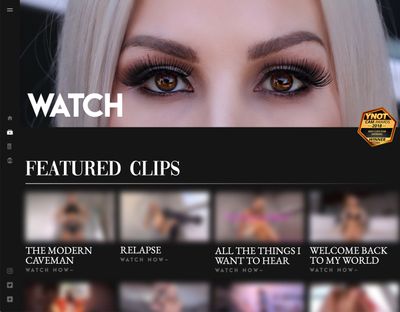
Among her fans, DGJ encourages a “frenzy” of buying/viewing activity, and I wanted to capture this feeling of binging on the site. Platforms like Netflix and YouTube are both excellent at this kind of habit-forming, so I decided to mirror their layout a little bit, grabbing the side-mounted, iconographic navigation on larger screens, and featuring video content in a super-scrollable gallery-style format.

Code
Simply based on the nature of DGJ’s work, we faced a lot of challenges I haven’t encountered before. Since a huge number of companies discriminate against and disallow sex work on their platform, we had to get creative about how we handle hosting, form handling, payments, etc.
Stack
For a project of this scale, I generally have a fairly strong idea of the stack I’d like to use. I have plenty of experience with Wordpress and Drupal, and feel pretty strongly that they’re drastically overwrought for most applications.
Here’s my patented Very Complex and Meticulous Thought Process for Choosing a Web Development Platform:
- Vue is Tight™.
- Static site generators are Tight™.
- Nuxt.js, QED, baby.
(…and Sass for style, of course.)
Hosting & Continuous Deployment
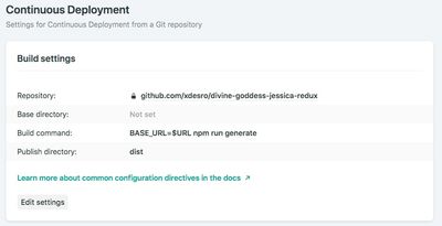
So, I should probably mention at this point that I’m a die-hard Netlify fangirl, and have been for a long time. They’re consistently spearheading huge quality-of-life improvements for developer experience across the web. Deploying the project quickly (and redeploying every time there’s a commit to the master branch on GitHub) is so painless and easy, I usually will set it up as soon as I git commit -m "🎉 - init commit". It’s free to deploy and set a custom domain.

Forms
DGJ collects applications from users to become a member of her community. In her previous site, she had been handling these submissions with a JotForm <iframe>, which looked completely terrible, and was one more external dependency and subscription.
I initially looked to Netlify Forms to solve this, but because I didn’t want DGJ to have to log in to a dashboard to check her form submissions, I decided to go down the lambda functions route.
I marked up the form in a Vue component, then told the component to fire form submissions as JSON to a serverless function, which would handle the actual work of sending the JSON to DGJ’s email. Next, I needed a transactional email API to send through when the serverless function was called.
Postmark was the solution for this — they have a free tier that easily covered the amount of submissions we were expecting monthly, and the cost to scale up was trivial should we hit the need to switch to a paid tier. I just set up an account, grabbed an API key, and plugged it into the serverless function. Bam. Form submissions captured and send as email.
Content Management
DGJ frequently writes blogs and instructional articles for new converts, so maintaining the content-management ability that Wordpress allows for was a must-have. There’s a ton of really cool headless CMS platforms out there for use with static sites (this particular case study, for example, was penned in Contentful), but to carry on the pattern of tooting Netlify’s horn, I elected to use an open-source project from the team called Netlify CMS. It’s the simplest little install (just a CDN link in an HTML file renders a React-based GUI at the URL you specify), and changes to content are captured in git. The basic workflow is like this:
- Add the
index.htmlandconfig.ymlper their getting started guide, and edit the configuration to include the content types and fields for your use case. - Access the GUI for the CMS after authenticating with (surprise!) Netlify Identity
- Content is consumed from the flat file (usually Markdown, but can be JSON, etc) directory you specify.
- Making changes to files fires a git commit with that update, and the site rebuilds via Netlify CI.
Netlify Everything: It’s just that simple™.
You can view the finished project at divinegoddessjessica.com.
Addendum RE: Language
Throughout this article, I did not refer to any of this content, nor DGJ’s labor or endeavors as “NSFW”. The term “Not Safe For Work” implies that what DGJ does isn’t work, which is laughably untrue. While it’s true that you probably shouldn’t bust open her site in front of your boss, making the distinction between “adult content” and “SFW content” is super important in the fight for sex workers’ rights. Sex work is work.