
Frontier Label
A modernized, thoughtful brand identity and digital presence for a family-owned, Greenville-based labeling team, founded in regimented interface principles and tempered by the neighborhoodliness of DTC design language.
In October 2020, I worked with Greenville, South Carolina custom labeling business on a reimagining of their digital presence. Modern but friendly, capturing a meticulously-crafted ecommerce browsing experience through strong interaction and interface principles, and wrapped up in a clean, boutique DTC design language, I designed the updated digital brand identity of Frontier Label as well as their new marketing website and mass-ordering customizer tool.
When they came to work with me and the Faculty Team, Frontier Label already had a strong business doing large-quantity orders over the phone, but they recognized the vast opportunity that a well-reasoned redesign of both the marketing site and customizer properties could hold.
It was essential that a new imagining of these properties took into consideration Frontier Label’s existing base of powerusers, as well as those repeat customers who preferred to begin an order online and complete it over the phone.
⛓ A Better Brand
I worked closely with the esteemed art director Mr. Doug Wilson, who was on deck at all times with his invaluable type and color expertise as we reworked aspects of the brand identity to produce something that still had Frontier Label spirit, but would appeal to more discerning users, who are used to very strong browsing experiences online. We found those qualities in the pairing of Berlingske Serif as our display face — a readable, calligraphy-inspired serif with the right amount of personality — and Klim’s Founders Grotesk to do our UI and content lifting, which was just off-the-beaten-path enough to feel special without being overbearing in its application.
Together, we worked to collect a strong color palette, something soft-toned and informal to get that DTC vibe, but with a little more reservation and maturity. Mr. Wilson fleshed out a really solid accent palette to serve as an auxiliary when the user interface would call for focused attention or to communicate statefulness.
Next, I identified that Frontier Label’s existing photography was one of the weaker parts of their identity. After an extensive research period, I felt it was imperative that the new website be carried by some really great photography that could show the expansive product line in context. We wrote new brand photography guidelines, inspired again by the readiness DTC brands to share their personality, to serve the team’s photography needs both now and in the future.
⛓ Design System
From the brief, Faculty had an immediate need to solve Frontier Label’s online customization-and-ordering system. As it stood when they came to us, most orders were made partially online and then immediately transferred to a client services team to complete, and often clients would skip the online experience entirely.
Faculty spent time as a team diagramming out and challenging different experience flows to ensure we delivered a bulletproof ecommerce solution to Frontier Label. From this experimentation, a design system and library of user interface patterns and components was created, to serve not only the existing needs of the team, but any future interfaces they might build.
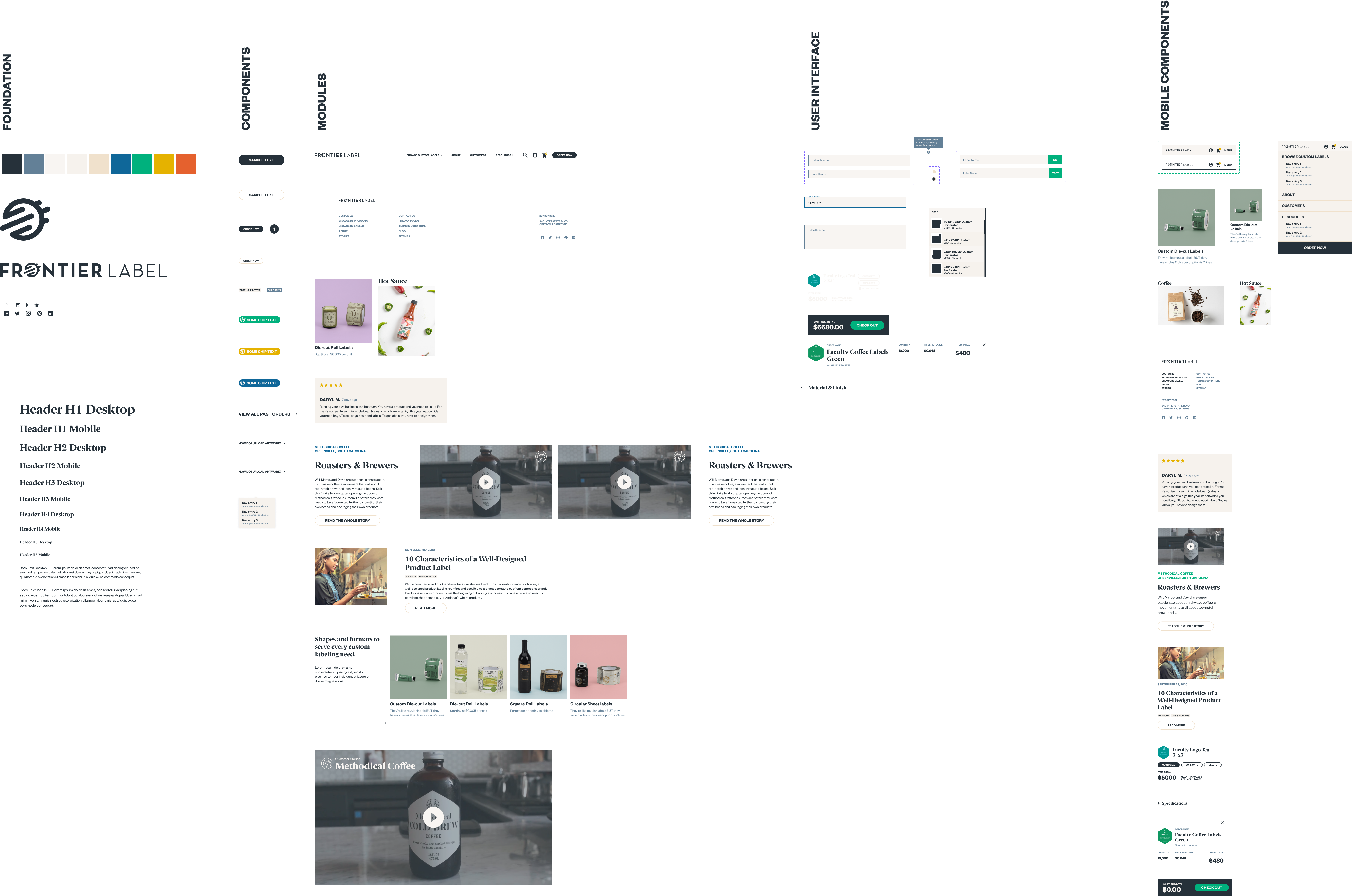
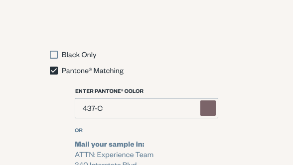
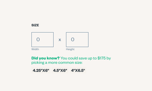
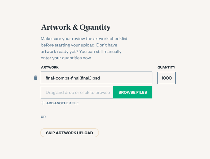
Some highlights from this process include a custom component created for Frontier Label’s PantoneⓇ matching service, a pattern for suggesting recommended label sizes to save the customer money, or a pattern for uploading multiple custom artwork files and quantities.
⛓ TL;DR
With a bold but trustworthy design and completely refreshed brand identity and design system, the team at Faculty and I have created a modern and robust ecommerce experience to serve many varied styles of clientele. Blending a sense of personality and neighborly warmth with a regimented, robust approach to the user interface, Frontier Label’s new digital presence will allow them to continue to grow and thrive to yet new heights.