I worked full-time at YouTube for two years as one of three UX Engineers in the Art Department. This role was super eclectic, and consisted of a 30:70 hybrid between design and front-end development work. We were primarily responsible for maintaining Standards, an extremely robust knowledge-sharing platform that allows designers to learn about the YouTube design system, and get related resources. I also led an in-depth audit of the web application’s focus states for visual and interactive accessibility. As the resident web development enthusiast on the team, I also built a few different really cool website projects for internal events and for the marketing team.
All of these projects were super engaging and are each deserving of a full case study, but I’ll speak to my involvement, challenges, and successes of each one briefly to keep this puppy readable.
In a major restructuring of the Art Department structure, the engineering team was dissolved, which resulted in my role being eliminated in spring of 2024. I’m currently seeking my next full-time role.
Design Systems & Standards
The majority of my work at YouTube was the creation of pages and interfaces for Standards. Standards does a lot, but is mostly an internal platform for documenting and communicating the YouTube design system and its priorities to YouTube designers, developers, and external partners. I built pages in HTML, CSS, and Angular to teach concepts such as how YouTube uses shapes, gradients, and more to communicate meaningfully with users.
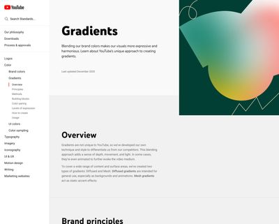
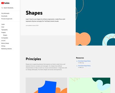
I also built some really cool tools for educating how technologies like variable fonts work, allowing engineers and designers to play with different axes and showing designers how subtle variations in font-weight and optical sizing can make huge differences in readability through color scheme changes, etc.
The variable fonts tooling, for example, guided readers through the basic concepts of variable fonts, their usage and implementation on the web, and finally how YouTube leverages this technology in its brand and for its users, even letting designers choose presets for different contexts.
For reasons I can’t share exactly the tooling I created, but I’ve created a similar demo of some of the features here.
Takeaways
Over the course of my tenure with YouTube, we built a ton of really cool features and enhancements for the Standards platform. Working out the best way to make design systems patterns concise and durable all the way from the component level to the holistic ethos level was a super interesting creative challenge, especially with so many stakeholding designers on so many teams.
Accessibility Auditing & Improvements
As YouTube is a huge platform, built by many teams over many years, there are inevitably some shifts in priority and focus — regrettably, accessibility is one of the first aspects of implementation that fails when timelines are shortened.
I’ll stuff my lecture on why this is totally egregious when writing code with web-standards-first principles makes things progressively-enhanced and accessible by default, but you are free to imagine a fairy-sized cartoon version of me shouting indecipherably into a loudspeaker while buzzing around the office if it so pleaseth thee.
Business needs and web projects intersect in complicated and angular ways, and even with best intentions things are bound to slip through the cracks. I’ve found it’s joyful and fulfilling work to audit and improve the accessibility of any websites I’m working on — “there’s always ways to improve the accessibility” is the web equivalent of “there’s always money in the banana stand”. I was grateful for the opportunity to do this with the YouTube web app.
Collaborative Scope & Initial Audit Results
I wanted to start my audit with a scope that would resonate with the powers-that-be, stakeholders who might allow me to invest more time and effort in a project like this. I chose to pursue an accessibility failure that overlapped with the business interests of the company: the implementation of focus state visual indication for interactive elements.
In my initial audit, I found there to be oceans of disagreement between how the designers on the YouTube Material team had specified interactive focus, and how it had been implemented. Frequently, I found differences between implementations page-to-page and even component-to-component in the same interface module.
For instance, at the time of writing, there are six different ways that visual focus is indicated on a button in the masthead of the YouTube app alone.

After some initial conversations with my team and the YouTube Material Design lead, I went through the entire YouTube desktop app, testing every interactive app to make sure it A. could receive visual focus in meaningful order, B. visually-indicated focus to the user in an accessible way, and C. visually-indicated focus to the user as specified by the design systems team. I created a document that enumerated every instance of elements that failed these requirements, with my recommendations on the urgency and best strategy for their repair.
In general, most of the fixes were fairly straightforward. The largest consistent failures were:
-
Chips elements, which barely had a focus/hover indication when unselected and not at all when selected,
-
Search page video results, which did not have a meaningful focus order, nor visual focus,
-
Expandable “details” sections, like video descriptions, which moved focus irrationally, and visually-indicated only in a slight change in font weight.
-
We found a ton of loose additional failures, like the inconsistencies in the page nav identified before. It was easy at this point to break these elements into sprints of code work and start cookin’ on fixes.
Reimplementation Phase
From my document identifying every visual focus failure, I categorized and triaged each failure, sorting the list by lowest effort and highest impact. The chips were identified as the most obvious win, followed by getting the masthead top nav right. Both of these projects could be taken on by me, in collaboration with the Web team to make sure everything is meticulously reviewed and tested.
As is perpetually the case at companies this size, the codebase was in transition between one component architecture to another, so changing the buttons in the masthead to match was mostly an effort of updating each instance of a button to the most modern version and then updating that version to have the design-team-specified focus indicator.
The chips component had already been upgraded, and was blissfully universal in its application. Its interactive accessibility failure had also already been solved for by the design team, and was just out of date, so fixing it site-wide took around 6 lines of CSS.
Tragedy strikes
Both of these first efforts were code-written and -approved in March 2024, but never made it to production before the Art Department engineering team was laid off. I’m proud of the work, and I think if and when it makes it to production, it will have a meaningful impact on the user experience, but I also think it might be an eon before the web team has bandwidth to unarchive this effort and ship it to users.
Interactive Web Experiences
In between design systems projects and the accessibility effort, I was grateful to work on some really killer web projects, with the Art Department and the Marketing team. I was hired on to the Art Dept. primarily for my web development expertise, and it was a fantastic opportunity to leverage that expertise a few times over the course of my time with YouTube.
Design & development for FORM
This was actually my first major project after joining the team. After spinning up on some page builds for Standards, I was asked to create an event website for “FORM”, an internal conference for designers at YouTube to share new ideas and patterns and plans for the future with each other, to be held in the Los Angeles office later in the year. The team working on organizing the conference had already done a really nice job of generating color palette, type, and design language motifs for their print collateral, and asked me to re-interpret these materials in a web context to share details about the event, how to get registered, learn about the talk schedule etc.
I rapidly designed a ton of comps to present to the team, to get a better idea of where they’d like to head.
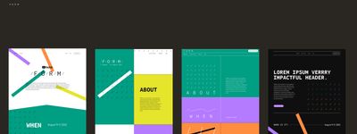
I wanted to do a little Proving Myself in developing the interactivity and animation of the site, both to Surprise and Delight™ folks visiting, and to show how useful I could be for this sort of work. I presented prototypes and ideas for inertial movement of design elements within the page, Steven Soderbergh-esque panel transitions on scroll, and more.
The code for the site was written in HTML and CSS, just like old times, and used Google’s internal version control and continuous integration for deployment.
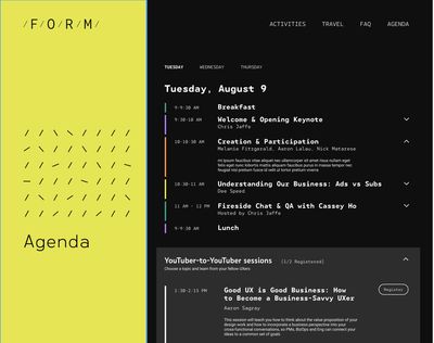
After the event, we worked our way back through the site to provide recordings and transcriptions to attendees.
The really cool work done for this event was my coworker Mattaniah’s generative art system for creating completely unique and personalized nametags for attendees. Can’t recommend her case study on this work enough.
Countdowns
One of my favorite projects was my work on the Countdowns project, which was a way to archive and celebrate YouTube’s collection of motion design vignettes used to premiere new videos on the platform. The site, designed by the inimitable Jessie Zo, used a unique three-layout configuration to showcase each Countdown, imbue it with compelling personality, and feature the interview done with each motion designer that YouTube collaborated with.
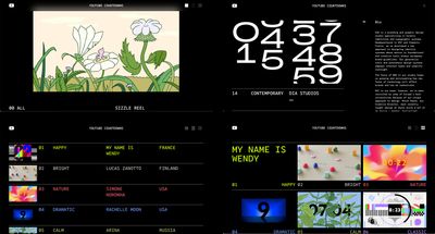
I initially joined the project at the start of the design phase, as an interactivity consultant. I worked with Jessie to isolate some really cool moments of interactivity, and then worked as a liaison between her and the adjunct engineering team that would be implementing her designs. I wrote technical specifications and documentation to accompany Jessie’s comps — I really enjoyed this sort of work, making sure a designer was able to execute on their fullest version of a project, and making sure engineering was enabled to hit the ground running.
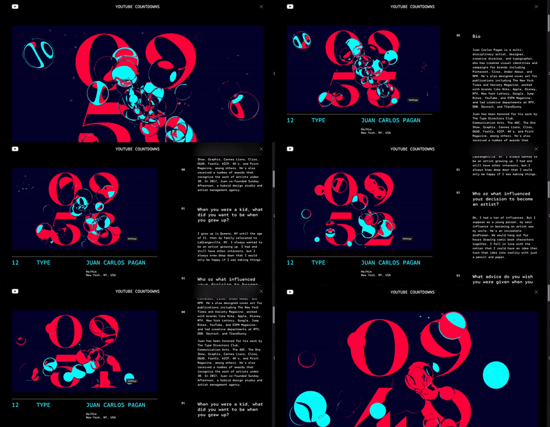
I actually ended up back on this project in the end — a round of layoffs meant the eng team building Countdowns no longer existed. I stepped up to inherit the work of understanding how much of the project had already been built, and how much still needed doing.
Conclusion
I’d mostly just love to thank everyone who was kind and eager during my time at YouTube. I learned a lot in this role — but to my surprise, I learned more about higher-level business functions, getting folks unified, and integrating feedback, than I did about design or code. Utterly invaluable opportunity and I’m glad to have spent the time.
I’d like to especially thank my fellow UX Engineers Mattaniah Aytenfsu and Kelsey Mayfield, whose patience and guidance and good humor in our collaborations was the absolute highlight of my tenure.