
Introduction
So, I was looking for a fun example of UI interactivity to prototype on Codepen, and I stumbled upon this really cool shot that Alexsander Barhon shared.
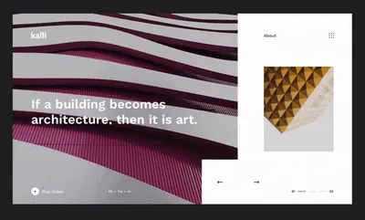
It’s a simple enough animation, with a really nice loading effect and staggered timeline that make it feel super fluid. I’ve been really into Vue.js lately, and this seemed like a perfect opportunity to code out a little app. Live your life, but I’m gonna use SCSS for style here.
Tl;dr
If you wanna skip the tutorial and get the source, scroll to the bottom of the post or just go check out the finished pen. This post is gonna go pretty in-depth on everything it took to get this running, including the foundational CSS, etc. If you’re just looking for the Vue Interactivity or Vue transitions section, that’s cool too.
Getting Started
When I’m building components like this, I always try to get markup and style in place before trying to futz with JavaScript. That way, I can focus on making things semantic and DRY without adding an additional layer of abstraction.
Basic HTML Structure
There’s a bunch of different ways you could break this app down, but based on the way it animates in the Dribbble shot, I see it in three major components, and then a few sub-pieces:

The reason I keep the top navigation separate from the slider or sidebar is because it all animates in together and seems to generally serve the same purpose. There’s definitely an argument to be made that the “kalli” logo is part of the slider and the “about” section is part of the sidebar, but for the sake of this demo, I’m gonna keep them separate.
Let’s code it out:
<div class="viewport">
  <nav class="nav">
    <div class="nav__brand">
      <!-- Logo goes here. -->
    </div>
    <ul class="nav__list">
      <!-- Nav items go here. -->
    </ul>
  </nav>
  <main class="main">
    <div class="main__slider">
      <!-- Slides will go here -->
    </div>
    <div class="main__headline">
      <!-- Headline here -->
    </div>
    <div class="main__nav">
      <!-- Play video & social links will go here. -->
    </div>
  </main>
  <aside class="aside">
    <div class="aside__nav">
      <!-- Our buttons to navigate the slides will go in here. -->
    </div>
    <div class="aside__slider">
      <!-- Slider numero dos. No prob. -->
    </div>
    <div class="progress-indicator">
      <!-- This is like that 01———03 thing in the bottom right. -->
    </div>
  </aside>
</div>
So far so good. I’m using BEM-ish classes for everything, because I like how easy it is to organize in your SCSS without increasing specificity. (We typically want to avoid selectors like .nav .list or whatever, and sometimes Sass’ nesting feature can make that an easy trap to fall into. .nav__list is just as clear and much easier to override/much less specific.)
You’ll also notice I’m assigning seemingly-duplicative classes like .nav to the <nav> element or .aside to the <aside>. I don’t usually use tag name selectors for structural elements because it makes the CSS more dependent on the HTML structure.
Don’t worry about style just yet. If we make sure our HTML is meaningful and well-structured without style, it’ll be that much easier to write up the CSS.
Primary Nav
The navigation at the top has two distinct sections — the logo and the right-aligned nav items.
<nav class="nav">
  <div class="nav__brand">
    <p>Logo</p>
  </div>
  <ul class="nav__list">
    <li class="nav__list-item">About</li>
    <li class="nav__list-item">More</li>
  </ul>
</nav>
Main Section & Slider
I want to keep the slider slides and headline separate, because they animate in different ways, but close enough that they’re clearly related.
<main class="main">
  <div class="main__slider">
    <img class="main__slide-image" src="slide1.jpg" />
  </div>
  <div class="main__headline">
    <span class="main__headline-span"
      >Simplicity is the ultimate sophistication.</span
    >
  </div>
  <div class="main__nav">
    <p>Play Video</p>
    <ul class="social-links">
      <li class="social-links__item">
        <a href="https://facebook.com">Fb</a>
      </li>
      <li class="social-links__item">
        <a href="https://twitter.com/">Tw</a>
      </li>
      <li class="social-links__item">
        <a href="https://www.linkedin.com/">In</a>
      </li>
    </ul>
  </div>
</main>
Aside & Secondary Slider
I know we need two buttons that navigate forward and backward in the slider, a secondary container for the aside slider that we’ll mark up in a similar way to the first slider, and a progress indicator. I think I’m gonna use pseudo-elements for the counter on the progress indicator, so I’ll pass it the total number of slides via a data-slides-count attribute.
<aside class="aside">
  <div class="aside__nav">
    <button class="aside__button">←</button>
    <button class="aside__button">→</button>
  </div>
  <div class="aside__slider">
    <img class="aside__slide-image" src="slide2.jpg" />
  </div>
  <ul class="progress-indicator" data-slides-count="03">
    <li class="progress-indicator__bar"></li>
  </ul>
</aside>
And that’s the markup done. I really love coding these puppies in layers like this because now that I know that my HTML is sound, I don’t have to worry about it again for a while.
Basic Style
Let’s get Sassy with it. In my initial iteration of this idea, I used CSS variables and other weird stuff, so if you’re interested in that but have to support older browsers, it might be worth looking into a polyfill, or better yet, a ponyfill. 🦄 This version of the tutorial doesn’t include any of that crazy bonkers stuff.
“Responsive” CSS
I elected to use a pattern I lean on a lot for CodePens to make things “responsive”, where I set a font size for the app using viewport units and then measure everything based on that root font size using rem units. It looks a little something like this (note the #{} syntax for interpolating SCSS variables):
$app-width: 95vmin;
html {
  font-size: calc(#{$app-width} / 100);
}
.viewport {
  width: $app-width;
  height: calc(#{$app-width} * (9 / 16));
}
This block does a few things:
- I’ve decided I want my app to be as large as possible without ever touching the edge of the screen, so I’ll use
95vminto make sure it is always 95% of the width or the height of the screen (whichever is smaller). - In the
htmlselector, I set the font size to be 1/100th of the width of the app — that way I know that1remwill always be 1% of the width of the app. (This obviously isn’t required, I just like to have a very consistent and scalable unit to rely on when I’m making pens.) - I measured the sides of the app in the video on Dribbble, and found that the app’s aspect ratio was 16/9. Thus, I’ve set the
.viewport(which is the class I’ll add to my app wrapper) width to$app-widthand then set its height to$app-width * (9/16), to ensure it is always the correct aspect ratio.
Let’s keep trucking.
Layout Style
We’re gonna default to using CSS Grid for most of our layout problems, with some absolute positioning.
body {
  display: grid;
  place-items: center;
}
.viewport {
  position: relative;
  display: grid;
  grid-template-columns: 1fr 30rem;
  // width, height...
}
That’ll make the <aside> section 30% of the width of the app and the main slider will take up the rest of the available space. Let’s do the nav next.
.nav {
  padding: 5rem;
  display: grid;
  grid-auto-flow: column;
  justify-content: space-between;
  z-index: 1;
  position: absolute;
  top: 0;
  left: 0;
  right: 0;
  &__list {
    display: grid;
    grid-auto-flow: column;
    justify-content: space-between;
    width: 20rem;
    padding: 0; // Unset default ul padding. You could use a CSS reset too.
  }
}
So here we’ve decided the nav itself will be a grid, but by giving it position: absolute; we’re taking it out of the parent grid. (Z-index just makes sure it’s always the top-most element in the z-index stack.) Then we use the ampersand selector to style the right-aligned nav as grid as well. Let’s do the <main> section and its children.
.main {
  display: grid;
  grid-template-rows: 2fr 1fr;
  grid-template-areas: "headline" "nav";
  align-items: end;
  &__slider {
    position: absolute;
    z-index: 0;
    top: 0;
    left: 0;
    width: 70rem; (T
    height: 100%;
  }
  &__headline {
    padding: 5rem;
    grid-area: headline
  }
  &__nav {
    z-index: 1;
    display: grid;
    grid-template-columns: 1fr auto;
    grid-area: nav;
    width: 30rem;
    padding: 3rem 5rem; // I'm using 3rem vertical instead of 5rem all around cause it just looks better 👀
  }
}
.social-links {
  display: grid;
  grid-auto-flow: column;
  grid-gap: 0.4rem;
  align-items: center;
}
Movin’ right along. Let’s layout the <aside> element.
.aside {
  position: relative;
  display: grid;
  padding: 5rem; // That DANG 5rem padding again....
  $button-size: 10rem;
  &__slider {
    position: relative;
    height: 25rem;
    margin-top: 10rem;
  }
  &__button {
    width: $button-size;
    height: $button-size;
  }
  &__nav {
    position: absolute;
    bottom: 0;
    left: -#{$button-size};
  }
}
Same padding as the top nav, etc. here (if I was a clever person perhaps I’d make it a Sass variable like I did with the button sizing but I am not so here we go, baby).
Looking pretty slick so far. This looks about how we initially broke down the Dribbble screenshot.
Next we’ll add some more visual style to the app.
Visual Spice
So the first thing I’m gonna mention is that I don’t actually know what font is in use here off-hand, so I’ll be using instead this really nice sans-serif font called Inter. Let’s go ahead and include it in our style sheet.
@import url('https://rsms.me/inter/inter.css');
html {
  font-size: calc(#{$app-width} / 100);
  font-family: 'Inter', sans-serif;
  @supports (font-variation-settings: normal) {
    font-family: 'Inter var', sans-serif;
  }
}
Let’s style the pen a little bit so it’s not just a bunch of white rectangles. We’ll start with some variables and general app stuff.
$color--background: hsl(
  300,
  3%,
  15%
); // Note the $block--modifier syntax. This is just personal preference. Just be consistent!
$color--primary: hsl(0, 0%, 100%); // White color for most of the app.
$color--secondary: hsl(0, 0%, 90%); // Off-white for the progress indicator
$color--neutral: hsl(0, 0%, 1%); // Nearly-black color for text.

body {
  background-color: $color--background;
}
.viewport {
  background-color: $color--primary;
  box-shadow: 0 1rem 2rem hsla(0, 0%, 0%, 0.2);
}
Next we’ll do some placeholder images in this puppy and style up the slider.
In the HTML, we can use source.unsplash.com to get a random image that generally fits the size we want.
<div class="main__slider">
  <img
    class="main__slide-image"
    src="https://source.unsplash.com/random/1350x1080"
  />
</div>
<!-- ... -->
<div class="aside__slider">
  <img
    class="aside__slide-image"
    src="https://source.unsplash.com/random/1350x1080"
  />
</div>
In the SCSS, we’ll use the same code for the images twice, so let’s make it a @mixin. We’ll include that for both slide images and use overflow:hidden for the wrapping slider elements.
@mixin slide-image {
  position: absolute;
  height: 100%;
  object-fit: cover;
}
.main {
  // ...
  &__slider {
    //...
    overflow: hidden;
  }
  &__slide-image {
    @include slide-image;
  }
}
.aside {
  //...
  &__slider {
    //...
    overflow: hidden;
  }
  &__slide-image {
    @include slide-image;
  }
}
I think the last two kinda strange parts of this are the social links and the progress indicator. Let’s kick those off.
Progress Indicator
In CSS grid, you can actually use pseudo elements as grid-level elements, and that works out great for this example, where the social links are divided by two dashes. We already set the social links up as a grid, but now lets place the pseudo-elements in that grid:
.social-links {
  // ...
  &:before,
  &:after {
    content: '';
    display: block;
    width: 1rem;
    height: 0.1rem;
    background: $color--primary;
  }
  &:before {
    grid-column: 2;
  }
  &:after {
    grid-column: 4;
  }
}
That looks about right to me!

Next let’s do the progress indicator. We’ll use pseudo elements for the numbers at the start and end, and use <li> elements in between to show which slide is currently active.
.progress-indicator {
  // ...
  &:before,
  &:after {
    color: $color--neutral;
  }
  &:before {
    content: '01';
  }
  &:after {
    content: attr(data-slides-count);
  }
  &__bar {
    width: 1.5rem;
    height: 0.2rem;
    background: $color--secondary;
    &--active {
      background: $color--neutral;
    }
  }
}
Remember when we used a data-attribute to set the slides count? Here’s where it comes in handy. We can make that dynamic in the Vue step but for now we just did it manually.
<ul class="progress-indicator" data-slides-count="03"></ul>
Real nice:

I’ll breeze through the rest of the styles we’ll be adding. It’s mostly simple visual stuff like setting colors or font sizes — no more weird grid hackery. After all that, our slider’s about ready to become interactive!
Interactivity With Vue.js
The first thing we’ll do is get Vue included and turn our “app” into an App™.
In CodePen, under the Javascript settings tab, you can add Vue as an external resource:

Once we’ve got Vue included, let’s add an ID to the markup of the app and initialize a Vue instance.
<div class="viewport" id="app"></div>
const app = new Vue({
  el: '#app',
});
Adding Slides
In our Vue instance, let’s add some data for slides and a currently-active slide index, and then populate that data in the template markup.
const app = new Vue({
  el: '#app',
  data() {
    return {
      currentActiveSlide: 0,
      slides: [
        {
          headline: 'Lorem ipsum dolor sit amet',
          img: 'https://source.unsplash.com/random/1350x1080',
        },
        {
          headline: 'Consectetur adipiscing elit, sed do.',
          img: 'https://source.unsplash.com/random/1350x1081',
        },
        {
          headline: 'Eiusmod tempor incididunt ut labore.',
          img: 'https://source.unsplash.com/random/1350x1082',
        },
      ],
    };
  },
});
<div class="main__slider">
  <img
    v-for="(slide, index) of slides"
    :key="index"
    v-if="index === currentActiveSlide"
    class="main__slide-image"
    :src="slide.img"
  />
</div>
<div class="main__headline">
  <span
    v-for="(slide, index) of slides"
    :key="index"
    v-if="index === currentActiveSlide"
    class="main__headline-span"
  >
    {{ slide.headline }}
  </span>
</div>
You’ll notice we didn’t do anything for the slider in the <aside> section. That’s because I want the aside slider to always show the slide directly after the currently active one, or show the first slide if we’re at the end of the slides. I can do this with a Vue computed value we’ll call nextActiveSlide.
const app = new Vue({
  // ...
  computed: {
    nextActiveSlide() {
      return this.currentActiveSlide + 1 >= this.slides.length
        ? 0
        : this.currentActiveSlide + 1;
    },
  },
});
And once we’ve got that we can do this in the template:
<div class="aside__slider">
  <img
    v-for="(slide, index) of slides"
    :key="index"
    v-if="index === nextActiveSlide"
    class="aside__slide-image"
    :src="slide.img"
  />
</div>
Last thing to do is the progress indicator. We can do this all in the template, by creating as many progress bars as there are slides, and then conditionally adding a class if it should be active.
<ul class="progress-indicator" :data-slides-count="'0' + slides.length">
  <li
    v-for="(slide,index) of slides"
    :key="index"
    :class="index === currentActiveSlide ? 'progress-indicator__bar  progress-indicator__bar--active' : 'progress-indicator__bar'"
  ></li>
</ul>
Navigating Between Slides
The actual slide navigation is pretty simple, thanks to Vue – it’ll listen to the currentActiveSlide value and change everything we need based on that. We’ll add a method to handle slide changes. I’ve elected to be kinda wordy with this method for the sake of readability, but you could be much more concise!
const app = new Vue({
  // ...
  methods: {
    // We'll pass the function either 1 or -1 to indicate which direction we'the slides will go
    handleSlideChange(val) {
      let direction;
      const calculatedNextSlide = this.currentActiveSlide + val;
      if (val > 0) {
        direction = 'next';
      } else {
        direction = 'previous';
      }
      if (direction === 'next' && calculatedNextSlide < this.slides.length) {
        this.currentActiveSlide += val;
      } else if (direction === 'next') {
        this.currentActiveSlide = 0;
      } else if (direction === 'previous' && calculatedNextSlide < 0) {
        this.currentActiveSlide = this.slides.length - 1;
      } else {
        this.currentActiveSlide += val;
      }
    },
  },
});
Then in our markup we’ll update those buttons in the <aside> section so when clicked, they call that handleSlideChange() method.
<div class="aside__nav">
  <button class="aside__button" @click="handleSlideChange(-1)">←</button>
  <button class="aside__button" @click="handleSlideChange(1)">→</button>
</div>
And just like that, we’re all hooked up to data, slidin’ around, and ready to animate.
Animating With Vue.js <transition> and <transition-group>
In Vue, you can use the <transition> component to trigger animations in CSS or fire JavaScript methods on state changes. We’ll be handling all of our transitions with CSS this time around, but you can check the exceptional Vue docs for more potential uses. The general flow is that
Let’s start by transitioning the headline when you change slides with <transition-group>, which is best for list transitions.
Transitioning the Headline
The first step is to convert the .main__headline div into a <transition-group>:
<transition-group
  tag="div"
  class="main__headline"
  name="main__headline-span"
  mode="out-in"
>
  <span
    v-for="(slide, index) of slides"
    :key="index"
    v-if="index === currentActiveSlide"
    class="main__headline-span"
  >
    {{ slide.headline }}
  </span>
</transition-group>
There are a few things going on here:
-
We replaced the
<div>element with a<transition-group tag="div">element. The group will render as a<div>. -
We gave that transition group a name of
main__headline-span— what this means is that when a transition is occurring, it’ll apply the transition classes to its children with this prefix. For example:.main__headline-span-enter-active.main__headline-span-leave-to
(This will come in handy when we’re writing our transition code in SCSS.)
-
We set the mode to “out-in” — this basically means the element that we’re transitioning out will be completely transitioned out before we start transitioning in the new element.
Now we can write the CSS to make some magic happen.
// ...
.main {
  // ...
  &__headline-span {
    position: absolute; // This is just to make sure there's no jumping around as we transition elements out and in.
    width: 60rem; // We have to add this because we're absolutely positioning the headline-span
    &-enter,
    &-leave-to {
      // This is an easy way for us to keep the animation code with the component code. This selector outputs `.main__headline-span-enter, .main__headline-span-leave-to {}`
      transform: translateY(1em);
      opacity: 0;
    }
    &-enter-active,
    &-leave-active {
      transition: all 300ms;
    }
    &-enter-active {
      transition-delay: 700ms; // This makes the new headline take just a moment to come in.
    }
  }
}
Transitioning The Slides Using clip-path
Let’s use <transition-group> again to prepare the main and aside sliders to be animated.
<!-- ... -->
<transition-group
  tag="div"
  class="main__slider"
  name="main__slide-image"
  mode="out-in"
>
  <img
    v-for="(slide, index) of slides"
    :key="index"
    v-if="index === currentActiveSlide"
    class="main__slide-image"
    :src="slide.img"
  />
</transition-group>
Same as the previous example, we replace the slider wrapper <div> with a <transition-group> that gets the class of its children as a name attribute. That’s all it takes. Let’s write some more CSS.
I’d like to use the CSS clip-path property to transition the slides — I think it’ll be the most visually-satisfying way to achieve that wipe that happens in the Dribbble shot. We’re going to transition a clip-path: polygon() value. When a slide is active, the clip-path won’t clip any of the image:

Since we want to wipe from left-to-right, we need two different clip paths:
- Clipped to the left side (“enter” state):
polygon(0 0, 0 0, 0 100%, 0 100%) - Clipped to the right side (“leave-to” state):
polygon(100% 0, 100% 100%, 100% 100%, 100% 0)
Let’s implement that in our SCSS. We’re reusing this animation for both sliders, so we’ll make it a mixin. (I also want a subtle zoom effect on the image.)
@mixin clip-path-wipe {
  clip-path: polygon(
    0 0,
    100% 0,
    100% 100%,
    0 100%
  ); // Specify the "slide visible" state
  &-enter {
    clip-path: polygon(0 0, 0 0, 0 100%, 0 100%);
    transform: scale(1.3);
  }
  &-leave-to {
    clip-path: polygon(100% 0, 100% 0, 100% 100%, 100% 100%);
    transform: scale(1.3);
  }
  &-enter-active {
    transition: all 700ms;
    transition-delay: 500ms;
  }
  &-leave-active {
    transition: all 700ms;
  }
}
Now let’s hook into this in the <main> slider.
.main {
  // ...
  &__slider {
    // ...
    background-color: $color--neutral; // This makes it so the slider background isn't just white.
    width: 70rem;
    overflow: hidden; // Make sure the image doesn't overflow when it scales up
  }
  &__slide-image {
    // ...
    @include clip-path-wipe;
  }
}
And again in the <aside> slider:
.aside {
  // ...
  &__slider {
    background-color: $color--neutral;
  }
  &__slide-image {
    // ...
    @include clip-path-wipe;
    &-leave-active {
      transition-delay: 200ms; // Offset this animation slightly from the main slider
    }
    &-enter-active {
      transition-delay: 600ms; // See above
    }
  }
}
Conclusion
And just like that, we’re all ready to rumble. If you wanted to, there are a couple of enhancements you could include:
- Write some CSS to transition the progress indicator a little more smoothly.
- Add a boolean
loadedstate to the Vuedata(), and transition in the navigation and slider depending on whetherloaded === trueor not. - Use Vibrant.js or similar to set the background of the slider to an accent color of the slider image!
If you end up giving this a shot or customizing it in any way, let me know on Bluesky [@strange.website]({{ ‘bluesky’ | getSocialUrl(social) }})! I’d love to see it. Thanks for reading. As promised, here’s the finished pen.
P.S. This is my first tutorial-style blog post — please let me know if you have any feedback or found any problems with the post! Thanks for reading.