
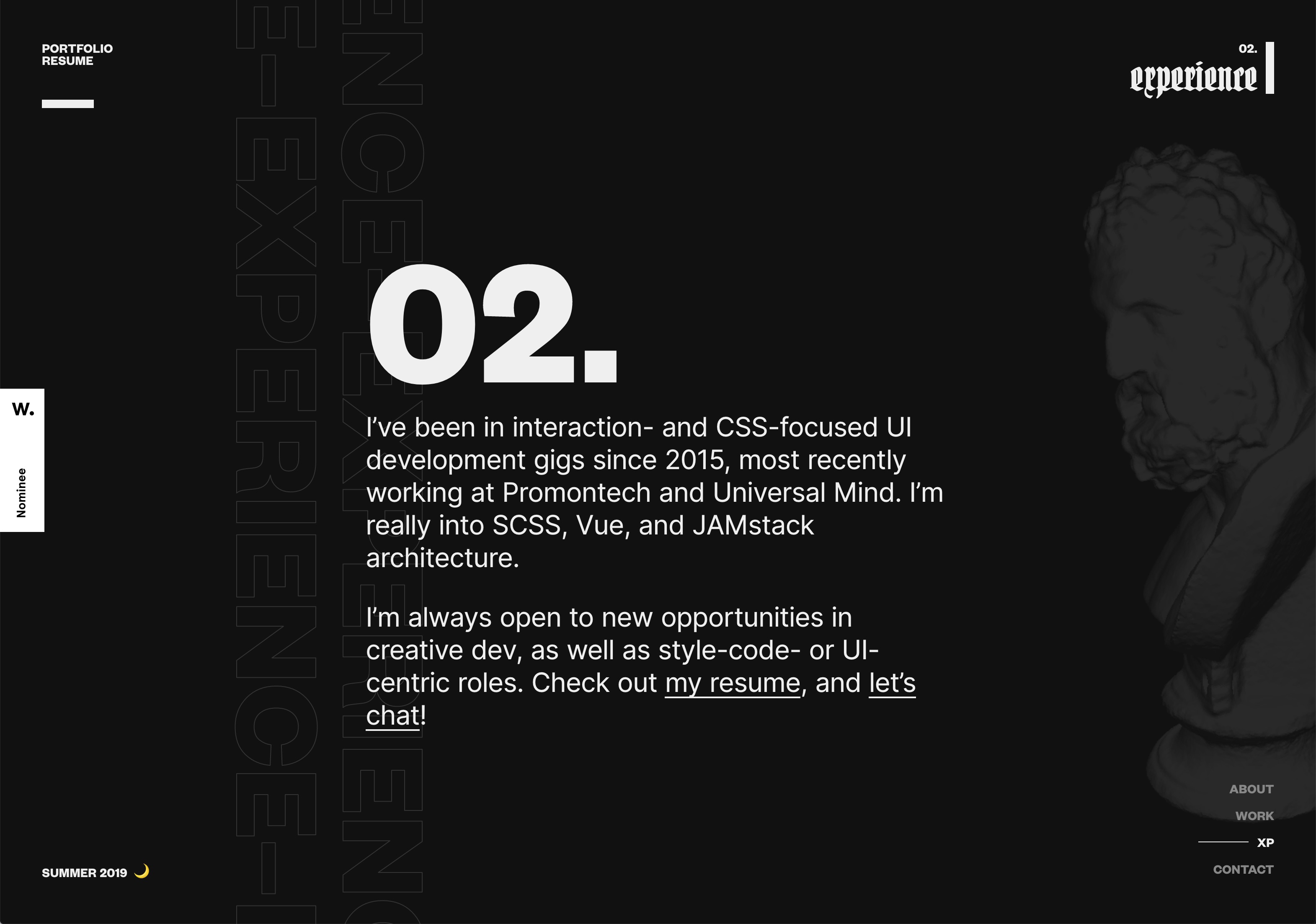
Portfolio SS19
View The Project LiveUnsatisfied with my two years out-of-date personal site and its ability to showcase my creative development ability, I endeavored to redesign with an updated aesthetic, fluid page transitions, and modern technology.
So, as of April 2019, my site hadn’t been updated in nearly two years.
- Portfolio projects were going defunct. Dead links. Dead links everywhere.
- The design was sophomoric and had 100% too much Futura.
- The tech didn’t adequately show my technical ability.
I redesigned with new priorities and new copy but missed the mark at first. A second major pass at a redesign was much more successful in representing me as a creative technologist with mad goth tendencies. Built with Vue, Nuxt.js, SCSS, and Three.js/WebGL. Deployed with Netlify.
⛓ Some Background
Before starting on this project, I hadn’t really touched my personal website since late 2017. I loved this design, once, but that love has faded with my love for Futura and ska music. Time to rebuild!
Yuck!
Offensive!
The site was previously a fairly simple static site project I designed, which I built with Hugo and some Markdown files. It was just three main views with short case studies for projects and external links for CodePens or tech demos. The whole project was a glorified resume without any work history, really. Nevertheless, I was really proud of this at the time, and it was my first major foray into static site generation for my own project.
⛓ Impetus
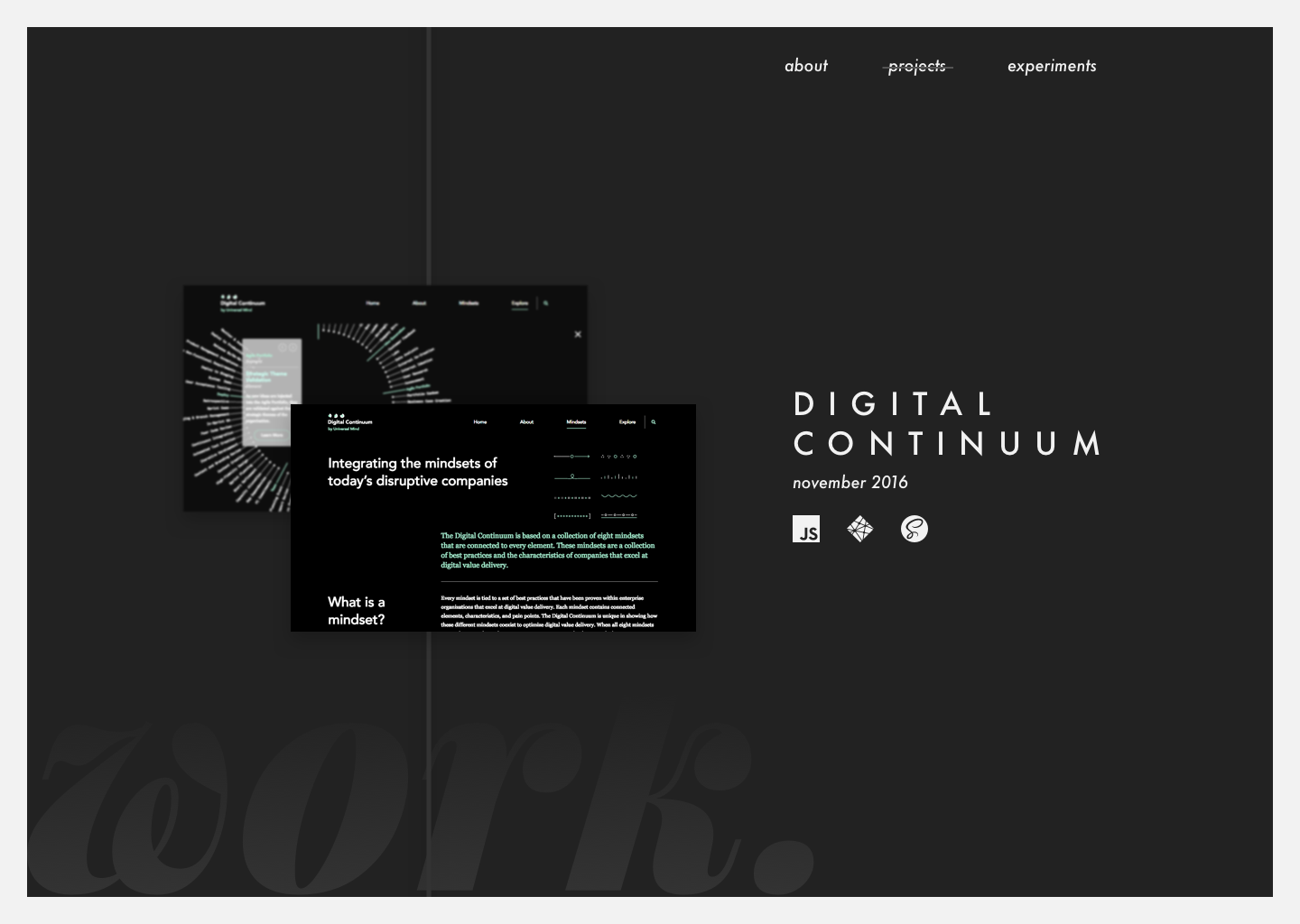
The first problems arose when the projects I had listed on the site (such as the Digital Continuum) started to get taken offline. I had the case studies but couldn’t show folks the scale or finished experience of a project.
Further, both my aesthetic sensibility and technical ability started to shift. I had learned a ton about JavaScript in the two years that had elapsed and wanted to showcase that growth a little more. I’ve also shifted my focus more towards UX engineering and creative development than front-end developer generalism and felt a need to highlight that as well.
⛓ Process
I knew I wanted to share the process of creating a new portfolio/personal site. I’d been streaming intermittently on Twitch at xdesro.live, sharing my code and techniques during Codevember, and building other projects, and I’ve found it’s a great way to build confidence in your learning process or quickly get help from people who might have more diverse experience than you.
Sketches
I hit the drawing board (read as: Sketch) a dozen times in the period between Deciding To Redesign and Successfully Redesigning.
The First Serious Attempt
I eventually decided I needed to ship something new, even if it wasn’t exactly the massive and beautiful undertaking I was envisioning. I came up with a pretty basic design that I felt was at least more up-to-date than my old site, and quickly built out an MVP version of it with Nuxt.js.
Some Highlights
- I love the idea of using gigantic body copy sizes. Xtian Miller has a brilliant post about why we should make text on the internet larger.
- I used a fun little SVG
<feTurbulence>primitive to perfrom some distortion animation text without any WebGL or JavaScript.

- I rewrote most of the copy for my updated brand for this iteration. My priorities and recent work are much different than they were, so this needed a big overhaul.
Back to the Drawing Board
I meant to progressively update the project to get it closer to the mockup, but by the time I had deployed the MVP, I had already fallen out of love with the design I had come up with. It wasn’t enough of a technical challenge, the colors were a little too garish, and it didn’t feel like it adequately leveraged my technical growth in the preceding years.
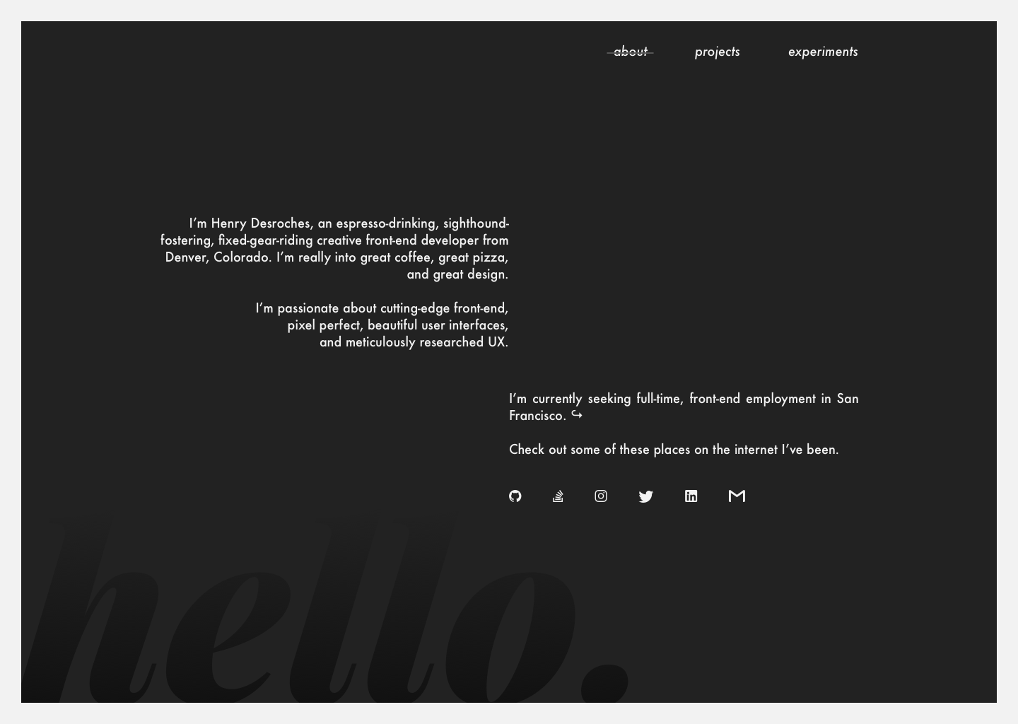
So we go again! This time with 100% more Goth, 100% more Swiss typography, 100% more unecessary vaporwave-inspired Roman statuary.
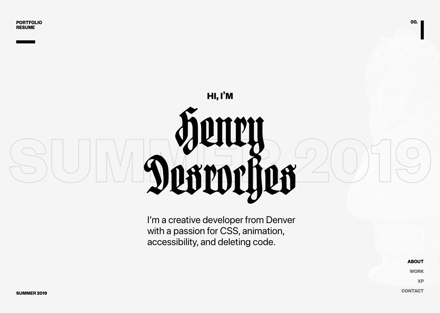
Bam!
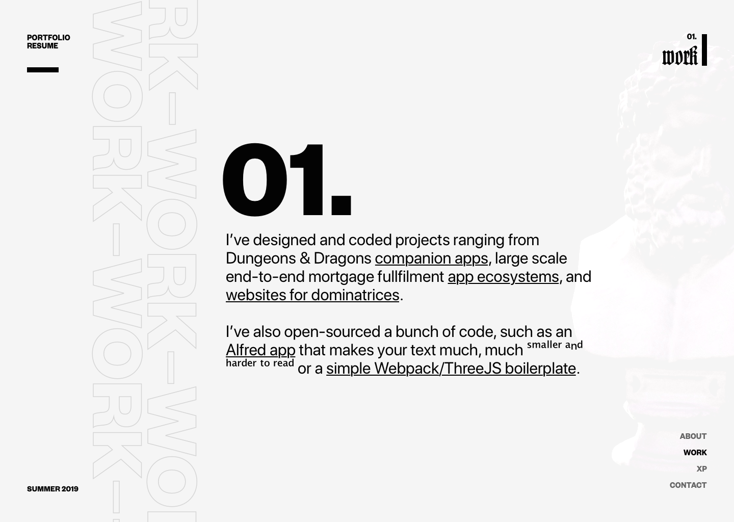
Zowie!
Look at that subtle off-white coloring. The tasteful thickness of it — oh my god…it even has a watermark.
I employed Founders Grotesk from Klim Type Foundry and a Hartwig-Schrift blackletter to do the heavy lifting for the layout, and snagged the statuary model from a creator sharing on Google’s Poly library, to be implemented with WebGL.
This was perfect — it felt editorial and opinionated and much more designerly. It had technical challenges like implementing WebGL interactivity.
⛓ Implementation & Challenges
I love using Nuxt.js — it’s a static site generator (which is the best kind of site generator), it leverages Vue and Vue’s great plugin ecosystem (which is the best kind of plugin ecosystem), and it is extraordinarily well-documented (which is the best amount of documentation), so I knew I was going to use it again for this project.
I used SCSS for style, as I am wont to do. The power of Sass comes in nesting, contextual &, and variables. I think there’s a lot of power in CSS vars, but there’s a time and a place! I’ll use a CSS variable if I’ve got a property I expect to change, but for the most part, Sass variables are my go-to for a few reasons: server-side rendering means I can make the browser do less work to show CSS, and support for arrays (i.e. “lists”) and objects (i.e. “maps”) means I can organize things like palettes and responsive breakpoints in a much more meaningful way.
glTF Rendering and Interactivity
Getting THREE.js and WebGL elements implemented and interactive was a whole bear in itself. I needed to accomplish a few things:
- Import a glTF model into a THREE.js scene.
✅ Done. Simple. Basically child’s play, thanks to THREE’s built-in glTFLoader. - Retexture the model so it fits the designed aesthetic.
✅ Surprisingly much trickier, but basically you have to reach inside the contained glTF scene and iterate over every child, and apply texture based on its type. I plan to write more about this. - Animate the model on
mousemove.
✅ It’s pretty straightforward to bind the position (or rotation) of a THREE.js object to an event. The more difficult part was to: - Ease the animation so it feels fluid.
✅ GSAP, GSAP, GSAP. It’s really nice to get controlled easing going with a little TweenLite magic. So fresh, so clean. - Compress the 3D model so it loads quickly and doesn’t lag for a thousand years before entering the scene.
👀 Well…I haven’t gotten around to this, yet. Theoretically this is super possible with DRACO compression of glTF files. I just haven’t done the footwork yet.
Page Transitions
Vue makes page transitions really easy to map out. You can scope everything to a single selector context and then just play with timing and easing. <transition> made all the difference for performant, FLIPing page transitions.
Dark Mode
I didn’t initially design for this, but I thought it’d be a fun little Easter egg to retrofit a dark mode that persists when you revisit the site. I just created a toggle that loads whether dark mode is enabled from state, and then stashes state to the user’s LocalStorage. To handle the actual re-theming, I just changed the values of some key CSS variables that the site’s stylesheet inherits, easy-peasy:
Highlights
- Bold and expressive typography. Turns out you can set literally anything in a blackletter and it looks fresh as heck.
- Vue
<transition>and<transition-group>for routing transitions is :chefs-kiss-emoji:. - Instead of
ease-in-outscrolljacking, use other design elements that animate along that easing curve to get the same feeling without disrupting user experience. - It’s definitely possible to implement and retexture a
.glTFmodel in THREE.js but you’re probably just better off using a.OBJfile.