Keybase
View The Project LiveKeybase is a safe, secure, and private app for everything you do online — but it's hard to explain just how safe, secure, and private to users who don't already understand cryptographic security. My team at Faculty and I worked with Keybase to create a digital book that would help folks understand how powerful and important digital cryptography can be.
Keybase Book was a new project my coworkers at Faculty and I created for the Keybase team. The project was intended to be a hybrid document that could both be functionally used as documentation, but also read in a more chapter-to-chapter mode that would teach users about PGP security and the value of the Keybase featureset.
This project was first and foremost an immense content strategy undertaking. I was honored to watch Chris Shiflett and Sara Distin work systematically and methodically to break an incredibly dense and obfuscate topic into manageable pieces such that even someone completely new to cryptographic technology could learn what the importance of the tooling was. I want to thank them, and thanks also to Kelli Anderson for having enormous creative vision with her illustration work, as well as for being an utter joy to work with and learn from. Without Chris, Sara, and Kelli, this project would’ve been impossible.
⛓ Design
With content strategy being largely handled by my incredibly capable coworkers, it was my task to design a web experience that was engaging, technical yet accessible, and above all highly readable.
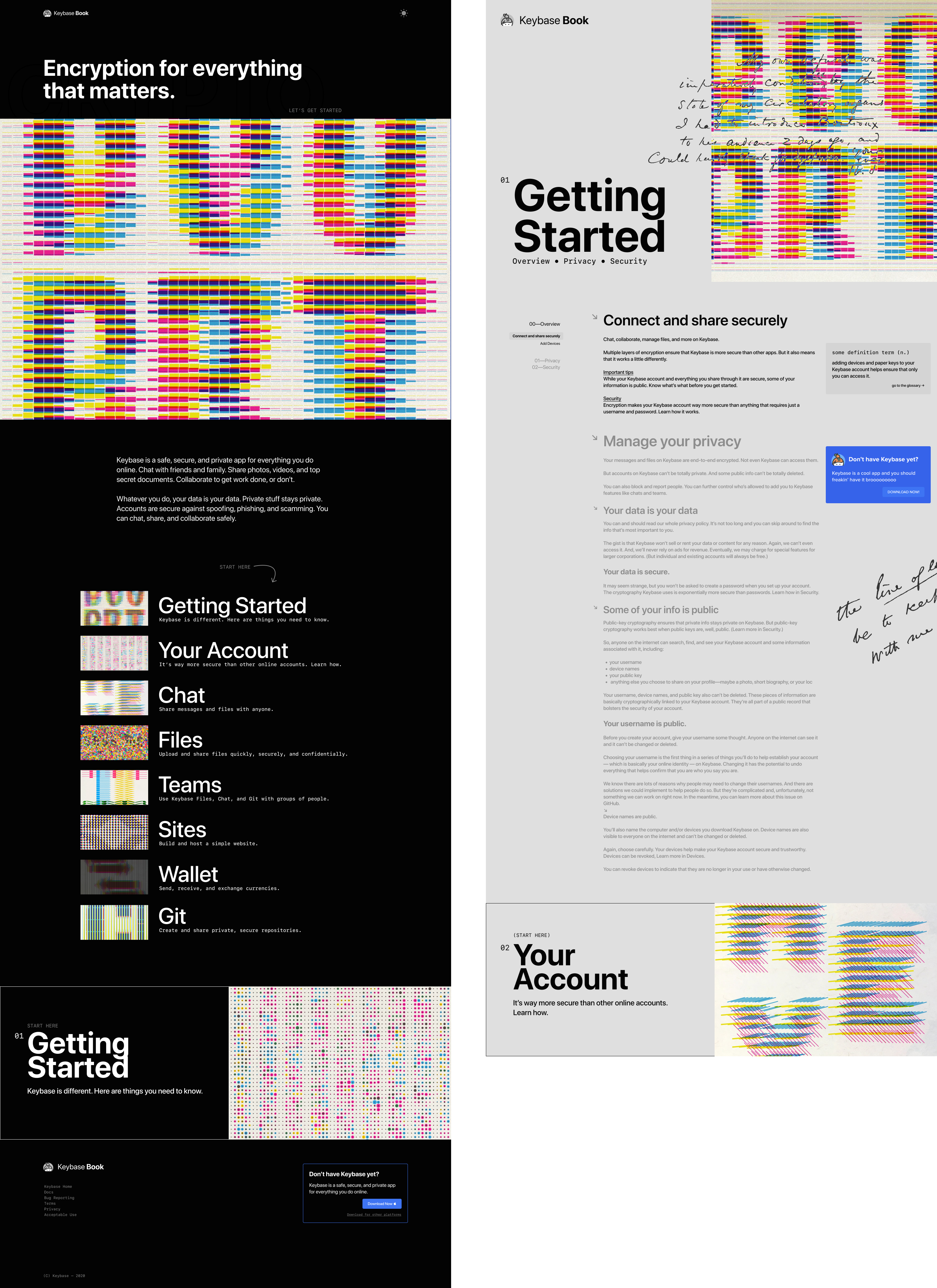
I endeavoured to diverge from the Keybase parent brand somewhat, to establish the Book as a separate property (indeed, the Book is now maintained by a community of open-source contributors), and because I felt the vibrant colors and quirky Recoleta headers wouldn’t lend as well to a strong reading-first experience. I kept enough of the Keybase brand equity in play that users wouldn’t feel completely , such as the logo and the brand blue for calls-to-action.
Layout
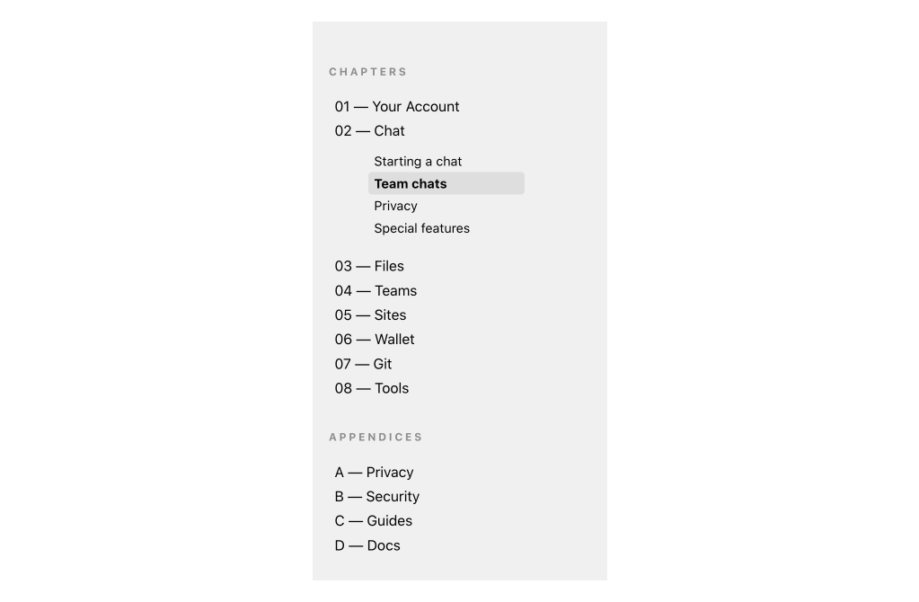
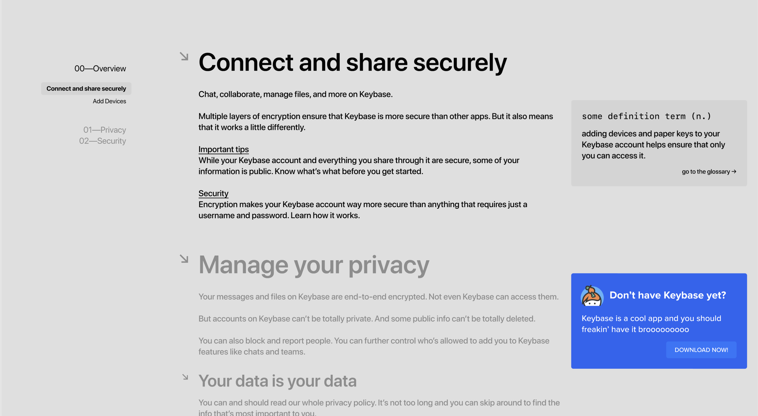
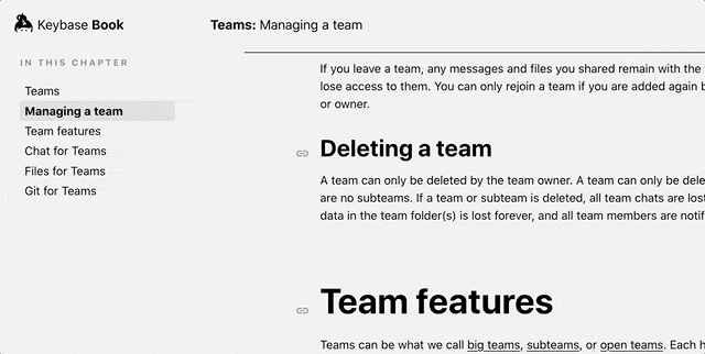
I designed most of the site around a global nav in the sidebar, a pattern borrowed from countless technical documentation sites. At any point, I wanted users to be able to see at-a-glance which page they’re on, where on the page they are, and allow them to easily navigate throughout the rest of the site.
I elected to use system fonts for the project — not only would this allow for blazing-fast loading times on a primarily text-based site, but would also be a sensible default for reading; system fonts are highly readable by design.
Another consideration I made was this three column layout, which allows for navigation in the first, a comfortable, uncramped reading experience with readable line-lengths in the second, and a third column for meta-information such as term definitions or Keybase-related calls-to-action.
Ilustration
As I mentioned before, this project gave me the distinct pleasure and opportunity to work with Kelli Anderson, an incredible illustrator who has a nigh-unrivaled understanding of printing techniques and tactile, multidimensional design. The team at Faculty pitched her the idea of doing a set of cryptography-inspired animated illustrations, which would be implemented as interactive, hardware-accelerated code. She came back to us with beautiful, technicolor, Karel Martens-esque vignettes that all played with the concept of encoding and decoding in a surprising way.
⛓ Code
The infrastructure for this project was decided elsewhere on the team, so my deliverable for this was just pure HTML (in Jinja template format), CSS (in Sass format), and JS (in JS format). The application used a proprietary Flask asset pipeline Faculty calls “Basis”, that handled the collection of a directory of content files in markdown format and providing that data to templates. As with all my work, I adhered to web platform and style code best practices. My primary focus on the implementation of this work was two-fold: 1. making the site as accessible a content experience as possible (readability, linkability, etc), and 2. converting Kelli’s fantastic illustrations to a canvas context.
Usability and Reading
In the design phase, I identified the need for extremely clear and strong navigation patterns. To ensure users could see their location at-a-glance at any time, I created a JavaScript class that would handle tracking the latest header, “activating” that header in the sidebar navigation, and updating the breadcrumb on the page.
You can see in that GIF a progress bar underneath the nav, which grows to span the width of the site as the user approaches the bottom of the current article. This uses a simple calculation to normalize the distance scrolled to the height of the page, and sets a CSS variable accordingly. The actual progress bar uses a transform: scaleX() rule to track this variable.
const handleProgress = () => {
  const percentageScrolled =
    (window.scrollY + window.innerHeight) /
    document.documentElement.offsetHeight;
  document.documentElement.style.setProperty(
    "--scrollProgress",
    `${percentageScrolled}`
  );
};
Illustrations
Since the illustrations are so diverse in style, there wasn’t much luck to be had in terms of process repeatability, but the general gist is that each chapter template output a <canvas> element, and loaded a specific illustration JS file for that chapter. With some exceptions, that file would contain an App ES6 class which was responsible for loading any required imagery, adding event listeners to the page or canvas, and initializing any requestAnimationFrame loops that would be used to animate each illustration at 60fps. For the benefit of any future maintaining developers, I kept configuration values such as easing curves, image file paths, etc. stored in config objects at the top of each file, with perhaps overly-human-readable key names. In general, with complex interaction JavaScript, I’m learning that I much prefer less-abstracted, less-concise code to very readable and parseable code. Anything from a const veryDescriptiveVariableName to higher-order Array functions if (veryDescriptivelyNamedArray.includes(theArrayItemWereTryingToFind)).
I spent a lot of time earlier in my careeer trying to be very clever with both my CSS and JS, and after having to return to my code with some elapsed time, I find myself wishing I had been more kind to future devs.
⛓ Post-Mortem
This project proved a great opportunity for me to collaborate from many aspects of a project with many verticals of product design, be it content strategists or other developers or illustrators. The book we created followed all usability best practices, was accessible and readable, and had a clean, concise design that neatly bookended the wealth of information it would render.
Keybase was acquired by Zoom about two months after this project launched. Much of the project has changed from our initial vision, and that community evolution is an exciting part of shipping open-source work. If you’d like to, it is still possible to check out the production instance of the Book.