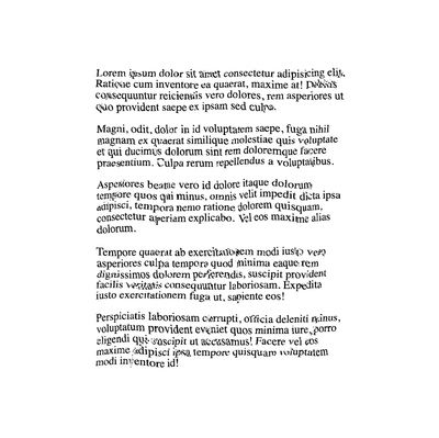
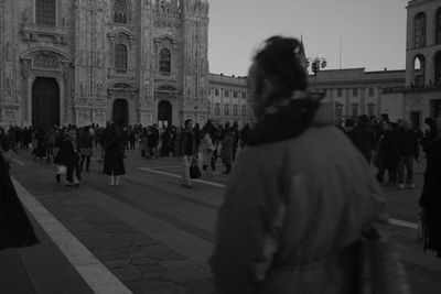
A lot of the SVG filter primitive content out there is some really rad, deep-dive type content (I’ll link some of these at the end!), so I reckoned it might be nice to do a quick write-up on some effects I use pretty commonly. These are more-or-less plug-and-play; simple filters for making your friends go “ooh how did u do that lmao”.

Setup
To kick this off, all we need is a super simple HTML file with a place for our CSS. We’ll create some placeholder text and an empty SVG tag.
<style></style>

<svg></svg>

<main>
  <p>
    Lorem ipsum dolor sit amet consectetur adipisicing elit. Ratione cum inventore ea quaerat,
    maxime at! Debitis consequuntur reiciendis vero dolores, rem asperiores ut quo provident saepe
    ex ipsam sed culpa.
  </p>
  <!-- ... -->
</main>
We’ll write a little CSS for now just to move our SVG out of our layout — we don’t actually need the SVG to render anything to the page, we just need it to do its magic filter math. Watch out, though: display: none; will hide the effects of the filter too.
<style>
  svg {
    position: absolute;
  }
</style>
Creating The Filter
Next we can add to the SVG to start our filter composition. We’ll add a <defs> tag and a <filter> tag — the <defs> actually isn’t necessary here since a <filter> won’t render anything on its own, but it’s a good indicator to future developers that “hey, this won’t be directly rendered anywhere,” or “hey, this will be used later”. We’ll give the <filter> an ID so we can call it in our CSS later.
<svg>
  <defs>
    <filter id="distort"></filter>
  </defs>
</svg>
To create the actual distortion effect is twofold — we need to first generate some random noise, then take that noise and move around pixels based on its output. If you’re new to composing SVG filters, I like to use the guitar pedalboard metaphor: you have a bunch of different effects available to you (in the form of “filter primitives”), each unique and configurable, and you pass a signal through them in any order to update that signal along the way. Hopefully the output is sick :)
Generating Noise
For this example, we’ll use the <feTurbulence> primitive to generate noise. You can read more about that bad boy here. We’ll give it a tiny baseFrequency for both x and y axes — you can play around with these values to get different effects once we’ve activated the filter. Higher values will make more thoroughly grainy noise! We’ll set numOctaves to 1 for now, though increasing the number of octaves will smooth the noise output. For this example I want it to look kinda janky. The last attribute we’ll add is result, which is an identifier so the next filter primitive can use the output of the turbulence. You can call it whatever!
<svg>
  <defs>
    <filter id="distortion-filter">
      <feTurbulence baseFrequency="0.01 0.01" numOctaves="1" result="noise" />
    </filter>
  </defs>
</svg>
Using a Displacement Map
Now we’ll use an <feDisplacementMap> primitive to move around the actual pixels of the text. This takes a few input attributes:
inis your primary image input. We can use the keywordSourceGraphic— this means it will displace whatever you apply the filter to, whether that’s some text, an image in your HTML, or some other SVG element.in2is the pixel data to displace the image we just added. We’ll takenoiseas our input 2, as that’s theresultof the first primitive we created.scaleis pretty straightforward; you can use any number. I usually tweak this logarithmically to find the effect I want (does 1 work? how about 2? how about 10? 50? 200, etc). We’ll use 10 here.xChannelSelectorandyChannelSelectortell the displacement map to grab the pixel values from one specific RGBA channel to displace. Since our pattern is totally random, we can use the same channel for both, but if you’re using normal maps or more complex displacement, you might need different values!
<svg>
	<defs>
		<filter id="distort">
			<feTurbulence baseFrequency="0.01 0.01" numOctaves="1" result="noise"  />
			<feDisplacementMap in="SourceGraphic" in2="noise" scale="10" xChannelSelector="R" yChannelSelector="R">
		</filter>
	</defs>
</svg>
That’s actually all we need for the filter! The more time you spend with filter primitives, the more easy it gets (usually) to read at-a-glance what a given filter is doing. Some people write some insane filter shit tho — the difference between “I completely understand this” and “I am a baby-brained fool” can be pretty narrow in my experience. The sky is really the limit with this stuff.
Applying The Filter
Now we can go into our CSS and apply the filter using that ID we created in the first step!
<style>
  /* ... */
  main {
    filter: url(#distort);
  }
</style>

Hell yea. So sick. The text is even still cursor-selectable. Feel empowered to tweak values and add primitives. There’s a whole world of wonder and image processing to be discovered.
Bonus: Motion Blur with Filters
Since we’re feeling so capable and technologically-enabled, let’s run another one. This one’s even simpler from an SVG standpoint. We’ll create another HTML snippet, just like the first one, but with some added CSS to do some clever text overlapping:
<style>
  svg {
    position: absolute;
  }
  h1 {
    position: relative;
  }
  h1:before {
    content: attr(data-text);
    position: absolute;
    top: 0;
    left: 0;
    filter: url(#motion-blur);
    opacity: 0.5; /* not necessary, just nice to soften the effect :) */
  }
</style>

<svg>
  <defs>
    <filter id="motion-blur"></filter>
  </defs>
</svg>

<h1 data-text="This is a title">This is a title</h1>
Adding the blur
Next, we can add our primitive to blur the text. For now we’ll blur horizontally cause that’s fairly simple to accomplish.
To blur at an angle, one might need to do a little Involved Mathematics to rotate/skew/counter-rotate the SourceGraphic, and it’s out of scope for this particular post :)
<svg>
  <defs>
    <filter id="motion-blur">
      <feGaussianBlur in="SourceGraphic" stdDeviation="10,0" />
    </filter>
  </defs>
</svg>

There’s a great post by Lucas Bebber on how to bind this effect to actual animation, if you’re interested in taking it a step further! I’ve linked that post in the last section.
Conclusion & Further Reading
Anyway thanks for checkin’ out the post. If you have any questions or you found a typo that you absolutely will die if I don’t correct, hit me via email or on Mastodon.
- Codrops’ SVG Filter Effects: Creating Texture with feTurbulence
- Sara Soueidan’s SVG Filters: The Crash Course talk
- Dirk Weber’s A Deep Dive Into The Wonderful World Of SVG Displacement Filtering
- Codrops’ Motion Blur Effect with SVG
